The Portfolio
Whether you’re looking for Art Prints that add nostalgic character to your home decor, or a one of a kind wedding/event stationery that captures your story. I bring a creative eye, a love for all things vintage-inspired, and a down to earth approach to every project. I want to make the design process feel easy, collaborative, and full of personality. With work that speaks to both you and your vision. Here’s what I’ve been working on recently.
When I discovered graphic design for the first time, it really was one of those cliche lightbulb moments. Where I realised I’d been immersed in it for years without knowing what it actually was. Coming from a family with backgrounds in Marketing, Architecture, and Design who also enjoy art in different forms, I shouldn’t have been surprised that it felt as natural as it did.
I loved watching and reading through advertising campaigns, seeing packaging design on new product launches when I’d be out shopping. And any time a business I loved had a rebrand, I would always fixate on it.
The colours, the illustrations, the imagery, the photography all of it blew me away. I loved it.
After I left college, studying Art and Business, I went on to intern in several local Advertising agencies and Design studios. But I was still waiting to find the right moment. It took a few years, and a few different career paths. But I knew that there wouldn’t be any other sector that felt as right for me than the creative industry. All that was left for me to do was practise my skills and learn as much as I could in the space and find my style and artistic flare again. Which has turned into what my business is today.
Designing my Brand Identity
When I was creating the first concept of Nat designed this. I wanted something cohesive that reflected both my personality and found a position in the market where I would be able to find the right audience who loved the concept of modern nostalgia. Indie styles and an appreciation for retro and vintage aesthetics. With this in mind, I set about working on the look and feel for the business, focusing on what that would look like for my ideal customer. It needed to be relatable, comforting and cool.
And this was the result….
Taking inspiration from a love of warm nostalgia and bold individuality. There has been a huge shift in the last few years towards pre 00’s lifestyle. I felt it myself especially over covid, for a simpler more expressive approach to things we enjoy in life. And a lot of that came through pop culture, fashion, music, homeware, design and art. As a way of people claiming back their individuality of the 70’s 80’s and 90’s and make it work in todays landscape.
There’s something comforting about throwback culture. The familiarity of what we had back then and what we experienced, and the need for it even more in modern society. With technology advancing faster than we can keep up with and modern world landscape changing every day. Sometimes you just want soemthing that reminds you of what you enjoyed. And for me that was, 80’s and 90’s Britpop indie music, vintage jackets and trainers and lots of bold maximalist art and homeware, that could elevate your space, make it unique but still grounded and homely.
To create the look of the brand, I set out to capture the golden glow of old school Polaroid’s, the softness of worn-in vinyl sleeves and the intimacy of dimly lit jazz lounges to create a colour scheme that felt timeless, but still approachable for today. Grounded in earthy tones yet lifted by light, romantic accents – so it could be cohesive across all of my products, commissions and projects without loosing its soul.
The aesthetic and feel for the business draws on decades of inspiration: the effortless cool of 80’s and 90’s indie icons, the romance of Fleetwood Mac harmonies, the cinematic allure of Stranger Things, and the unapologetic energy of the iconic Cindy Crawford Pepsi ad.
The patterns and textures – from checkerboards to smooth organic retro curves, add playfulness and visual rhythm while nods to feminism and indie music infuse a sense of celebration and self-expression. All of these elements created a brand design that is warm, yet rebellious, elegant yet approachable – a space where modern nostalgia meets creative independence.
The Kitchen Collection
This collection of art prints, is my latest collection of 2025. It gives a playful nod to the kitchens of decades past. Combining my hand drawn illustrations which give subtle reference to old style sauce bottles, to the instantly recognisable pint of Guinness. And a firm stable favourite of Northern tea drinkers everywhere.
The idea came about to create a collection dedicated to one area in the house, after my own kitchen walls being entirely blank for too long. I wanted to make something that felt familiar, relatable. But still had a edge to them. The type of art you couldn’t find just anywhere.
I carefully curated these designs to bring back feelings of nostalgic charm and warmth to the space. Whilst keeping the main focus on the illustration itself.
I wanted to keep to the theme of modern nostalgia with colour palettes in soft pinks, browns and yellows which reminds me of 70’s vintage core. Bold cohesive patterns that complimented the design, but at the same time, didn’t take away from the main drawing and retro typography to tie everything nicely together. What I came up with in the end were five designs, all with nods in varying degrees of subtlety to British (and Irish) day to day culture, things we don’t even think about but still wouldn’t know what to do without them. They’re timeless relatable. And most importantly spark a conversation. Which is the most important thing to have around the dinner table.
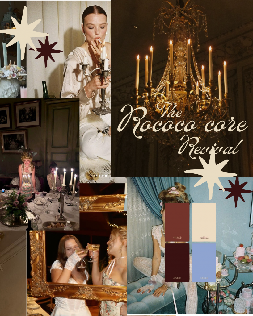
The Rococo Revival
 The Rococo Core. One of the three customisable stationery designs that I’ve created as part of my invite portfolio. Each one has been designed to suit a bold, vibrant theme. I may be biased but this one might be my favourite…
The Rococo Revival aesthetic. This invitation set was created inspired by whimsical romance, meeting timeless elegance. Inspired by the luxury French court, wild parties, candlelit dinners and decedent decor.
I drew this set to feature delicate hand drawn elements, pastel themes and dreamlike details for an intimate dinner party, or maybe a Bridgerton inspired birthday.
I included an illustration of a table scape scene to draw in the intimacy of this theme and bring in a sense of relaxed calm atmosphere, with a personal touch that you would get from a dinner party with friends. My invitation designs are all customisable, and available as both digital and physical copies which you will be able to order off my website soon.
A Dreamy Spring Wedding
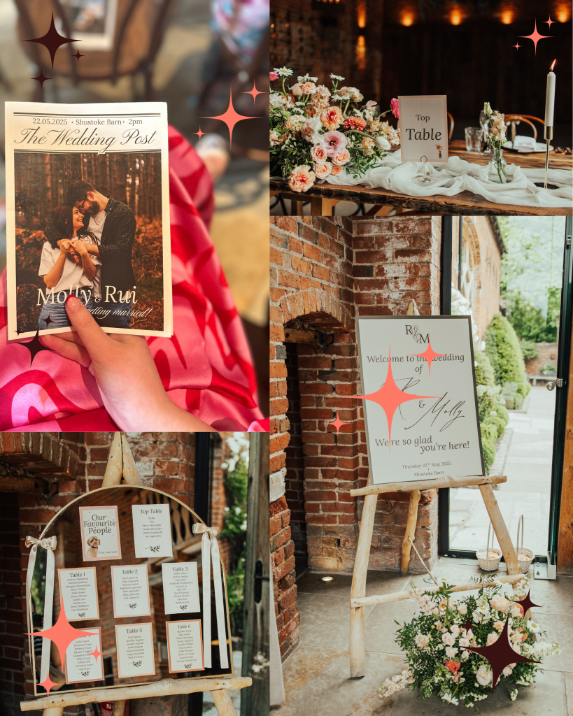
 My first Wedding Stationery Commission of 2025. This one was extra special to me as it was for one of my best friends.
I’m lucky that I have friends around me getting married, they’re perfect to have as my first customers, for both me and them. I was so grateful that Molly and her fiancé Rui trusted me enough to create a suite that was completely bespoke to them.
The theme was kept simple, taking inspiration for the natural setting of the venue, which was at the beautiful location of Shustoke Barn in the West Midlands. Using the organic, romantic details of the stone barn, it’s surroundings of the English countryside and the use of olive trees throughout the venue and courtyard. I created a stationery set that reflected the look and feel of the location, whilst also giving small details and personal touches of my best friend and her fiancé, to make it truly personal.
I reflected the aesthetic into the stationery by keeping things simple but personal, Molly wanted to emphasise the spring season and went above and beyond in using flowers as part of her wedding decor, (They were so stunning, I’d never seen florals like it) she also wanted to incorporate the venues olive trees that were in the courtyard and dotted around the space.
With all of this in mind, I worked to incorporate illustrations into each piece that would give a nod to the venues setting and decor, using the same colour palette that was used in the floral displays, pinks, creamy yellows, olive greens and pastel peach to make everything look cohesive and flow together.
The illustrations themselves were sketched out first and then hand drawn onto Procreate using the pencil and paint brush options, keeping them soft and minimal. And of course we had to include Mabel in this set. Their cockapoo was a guest of honour on the big day and is their gorgeous fur baby, it took me a few hours to get right but I managed to draw out her likeness and give her pride of place on the seating chart.
Finally, and perhaps my most favourite of the whole set, were the Wedding Newspapers!! These were so perfect, using photo’s from Molly and Rui’s engagement shoot, I drafted out a small newspaper as the order of service for each guest, with written notes and a personalised timeline of their relationship, from meeting at university to their wedding day. These were printed with the help of Crafty Lab, a wedding newspaper company based in Nottinghamshire, they were fantastic, I couldn’t have been happier with the results.
Rounding everything off nicely we worked together to create a stationery suite that was both soft and dreamy, and perfect for a spring wedding in May.
Molly and Rui’s Stationery set was part of my bespoke package, completely personalised and made to order.
